What is Colorimetry?
FREE - Contact lens trial
Conditions apply - apply in store for more details.
Colorimetry A Test For Visual Stress: A Distinct Perception Disorder
Formerly Recognised as Meares-Irlen Syndrome
Understanding Visual Stress
Visual stress is a unique perception disorder that should not be mistaken for a learning difficulty like dyslexia. Though some symptoms may overlap, the treatment approaches for these conditions differ significantly.
While visual stress may manifest alongside dyslexia, it can also accompany other neurological conditions, including MS, ME, epilepsy, and migraine.
Researchers are actively exploring these associations to shed more light on the subject. Distinguishing visual stress from dyslexia It is crucial to note that visual stress is not inherently linked to dyslexia. Individuals may experience either condition independently or even coexistent.
Overlays or tinted glasses are commonly employed to address visual stress, whereas dyslexia requires diverse educational techniques, such as multisensory learning. By presenting this information in a realistic tone, we aim to provide a clearer understanding of visual stress and its differentiation from dyslexia.

History of Visual Stress.
The emergence of visual stress in the field of science can be traced back to the year 1980, when Olive Meares first documented the symptoms associated with this condition.
It was Helen Irlen who later developed a diagnostic technique for visual stress and even patented a range of coloured overlays and tinted spectacle filters aimed at alleviating the distressing symptoms.
Initially, there was scepticism surrounding Irlen’s claims, as she failed to provide any peer-reviewed research data to support her treatment. However, subsequent research, including several double-masked, placebo-controlled trials, has provided some evidence, although not yet definitive, for the existence of this condition and the beneficial impact of coloured overlays and filters.
Over the years, numerous theories have been put forth in an attempt to unravel the underlying causes of visual stress. These theories encompass contrast sensitivity, retinal sensitivity, binocular and accommodative anomalies, a flawed magnocellular pathway, and cortical hyperexcitability. However, none of these theories can fully account for the diverse and specific colours required to alleviate the symptoms experienced by individuals with visual stress.
Olive Meares Study Into Visual Stress
A pivotal figure in the history of visual stress, Olive Meares, a teacher at a reading clinic in New Zealand, was the first to publish a report on the use of tinted overlays to aid individuals with reading difficulties. Meares embarked on her investigation by engaging with several children, questioning them about their experience when reading printed material.
It was during these interactions that she discovered a fascinating phenomenon: many children perceived words to be in motion or unstable, while the spaces between words seemed to transform into streams of white, thereby hindering their ability to read black print on white backgrounds.
This ground-breaking observation shed light on the challenges faced by individuals with visual stress and prompted the exploration of potential interventions to mitigate their reading difficulties (Meares, 1980).
Helen Irlen’s Study Into Visual Stress
In 1983, Helen Irlen, an American psychologist, delivered a presentation at the annual convention of the American Psychologist Association. Her paper focused on the use of coloured acetate sheets by some of her students to alleviate visual distortions while reading. This phenomenon was later termed Scotopic Sensitivity Syndrome (SSS) by Irlen. She further elaborated on her theory of SSS in her book “Reading by the Colours,” initially published in 1991.
Irlen’s extensive research on this topic spanned a decade during her tenure as a coordinator of an adult learning disability program funded by the federal government. Between 1981 and 1983, she conducted interviews with over 1500 adults struggling with reading difficulties.
Among this group, a participant emerged who possessed adequate phonetic skills, decoding abilities, and sight vocabulary. However, they still encountered significant challenges when it came to reading. Their complaints included letters and words appearing jumbled or in motion, white spaces forming streams across the page, and words transforming into black lines. These distortions intensified with prolonged reading, making comprehension increasingly difficult, if not impossible.
A breakthrough occurred when one of Irlen’s students retrieved a red overlay, which she had previously used during vision training exercises four years prior. Another student decided to experiment with a coloured acetate sheet on her page, and to her amazement, the distortions ceased. Encouraged by these outcomes, Irlen tested various coloured sheets and discovered that 31 out of her 35 students experienced a significant reduction in distortions, thus making reading easier with the assistance of a coloured overlay.
Interestingly, each student required a unique optimal colour, indicating the personalised nature of the solution. While the correlation between visual stress, migraines, and photosensitive epilepsy warrants further investigation, one aspect remains undisputed: the importance of conducting a comprehensive optometric and orthoptic examination for any patient reporting asthenopia or perceptual distortions.
This examination is crucial for ruling out visual or ocular motor issues that may manifest similar symptoms to those associated with visual stress.
Arnold Wilkins’s Study Into Visual Stress
Arnold Wilkins, a scientist employed by the Medical Research Council Applied Psychology Unit, was involved in a study on photosensitive epilepsy. The focus of their investigation was to understand how specific visual stimuli could trigger seizures.
They discovered that flickering light and certain visual patterns, such as stripes, could be epileptogenic. Interestingly, these patterns were also found to cause discomfort and various visual illusions, even in individuals who did not have epilepsy. This phenomenon was termed “pattern glare.” It was observed that individuals who experienced frequent headaches, particularly migraine sufferers, were more susceptible to these illusions.
The research conducted by Wilkins led him to propose a theory of visual stress, suggesting that certain characteristics of visual stimulation could lead to discomfort and even seizures.
During his work, Wilkins came across the claims made by Irlen regarding the ability of coloured filters to alleviate symptoms of visual perception dysfunction. He noticed a strong correlation between the symptoms reported in Irlen’s studies and those associated with visual stress.
Intrigued, Wilkins decided to investigate further by examining a group of individuals who claimed to have benefited from using Irlen’s filters. In his study, Wilkins compared the vision of these individuals using both coloured Irlen lenses and clear lenses.
The results showed a modest improvement in the speed of visual search, fewer illusions, and reduced headaches when using the tinted Irlen lenses. Additionally, some participants reported improved visual acuity and muscle balance. However, it is important to note that this study lacked a control group, which limits the extent to which we can draw conclusions from the findings.
The placebo effect was not a concern in this study, as the participants were already familiar with the colour of the lenses they were wearing and believed in the potential benefits of these coloured lenses as they were existing Irlen’s clients (Wilkins & Neary, 1991).
To address any potential placebo effects, Wilkins developed the Intuitive Colorimeter, a device that used coloured light to illuminate text. This allowed for a more thorough examination of patients who reported positive effects from using Irlen filters.
By systematically adjusting the hue, saturation, and brightness, the colourimeter helped determine the optimal colour for reducing visual distortions (Wilkins, 1995; 2002; 2003). Its purpose was to evaluate the chosen colour objectively, independent from any potential placebo influence.
It is important to clarify that coloured overlays are not specifically meant for dyslexia, contrary to popular belief. These overlays are primarily used for treating visual stress, a more prevalent eye condition (Wilkins, n.d.).
So, what are the symptoms of visual stress?
- Blurring of print.
- ‘Squashed up’ print.
- Movement of print: wiggling or vibration of letters.
- Letters muddling or words falling off the page’.
- Letters changing or double.
- Letters are fading or becoming darker.
- Patterns appearing in the print.
- Illusions of colour—blobs of colour moving on the page.
- Nausea, discomfort, or even pain caused by glare from the page.
- Rivers of light snaking through the text (often described as waterfalls).
- Headaches, tiredness, or sore eyes.
Signs of visual stress when reading:
- Moving closer to or away from the page or frequently changing position.
- Rubbing eyes.
- Excessively blinking or looking away from the page.
- Tiring quickly. Concentration may be poor, and attention span may be short.
- Poor assimilation of reading text.
- Losing place easily.
- Poor spelling.
- Misreading words.
- The speed of reading is slower than expected for intelligence.
How common is Visual Stress?
A significant number of individuals grow up completely unaware of their visual stress, remaining oblivious to the underlying cause of their slower reading speed compared to their peers. It is a perplexing situation for them, as they struggle to articulate the reason behind this disparity. Only when they view text through prescribed overlays do they truly comprehend the magnitude of their own symptoms.
Research suggests that approximately 20% of the population could benefit from utilising-coloured overlays, while for 5% of individuals, employing colour while reading would make an astounding difference to their educational journey.
As time progresses and their eyes grow weary, symptoms tend to intensify, making prolonged reading sessions increasingly arduous. Consequently, many individuals shy away from reading for extended periods or opt for materials such as magazines or comic books, which offer an easier reading experience with larger print.
Interestingly, a considerable number of sufferers remain completely unaware that their perception of text deviates from the expected norm. The presence of visual distortions has always been a constant in their lives, occasionally fluctuating in intensity from day to day. Certain print styles may prove more readable than others, leading them to dismiss their difficulties as mere tiredness or a lack of enthusiasm.
Is Visual Stress Hereditary?
Ongoing research suggests a familial correlation in the occurrence of visual stress. Therefore, it is highly recommended to conduct tests on other family members if either a child or parent is diagnosed with this condition.

What Are Coloured Overlays?
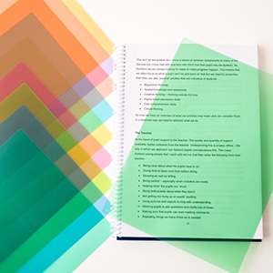
Rectangular sheets of translucent plastic in a variety of vibrant hues constitute coloured overlays. These overlays are meticulously crafted to be laid atop pages of books or any written content.
The assortment encompasses a vast spectrum of colours while allowing the possibility of layering two overlays to intensify and deepen the chromatic effect.
How Do You Use Coloured Overlays?
Position the overlay atop the text you are currently reading. Make sure that the overlay lies smoothly against the page without any trapped air bubbles beneath it. Be cautious not to fold, crumple, or write upon the overlay, as such actions will make it difficult to read through.
What Are The Benefits of Coloured Overlays?
Having the correct colour overlay for your visual needs will minimise your symptoms of visual stress, which therefore allows you to read quicker and for longer. A good way to describe visual overlays is that they comfort the eye, minimising the stress your eyes are under when reading.
What happens In A Colorimetry Assessment?
A comprehensive orthoptic evaluation will be conducted, encompassing a thorough examination of the patient’s medical history, visual acuity, and the coordination of their eyes in tandem, including depth perception and tracking abilities.
The primary objective of this assessment is to identify any indications of visual strain or discomfort. If such symptoms are detected, it is crucial to prescribe the appropriate colour overlay. It is important to note that different colours can either exacerbate or alleviate these symptoms, as each individual’s response may vary.
Upon establishing the presence of signs and symptoms, orthoptic exercises may be recommended if necessary. Additionally, a set of overlays will be provided for the patient to utilise over several weeks, allowing for a subjective evaluation of whether colour significantly impacts reading ability in terms of speed and fluency. Typically, this assessment is completed within thirty minutes.
In the event that a particular colour does not yield any noticeable changes, a colourimeter will be employed during a subsequent visit to accurately determine the ideal hue and saturation of the prescribed colour. This process generally takes around fifteen minutes. Should a specific colour be chosen, lenses will be employed to assess reading fluency. Subsequently, after a comprehensive eye examination, eyeglasses may be prescribed at this stage.

What Are The Benefits of Coloured Glasses?
Coloured overlays are specifically designed to enhance reading, but did you know that glasses can provide an additional advantage?
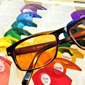
Not only can you wear glasses to improve your vision while reading, but tinted glasses can also be used to reduce glare from fluorescent lighting and whiteboards.
They can even come in handy when working on a PC monitor, tablet, or during supermarket shopping to read product labels. The possibilities are endless! It is highly recommended, especially for children, to try out their coloured overlays for a few months before considering investing in tinted glasses.
This way, they can assess the true benefits and determine if tinted glasses are the right choice for them. It is always wise to explore all options and find the best solution for individual needs.

Colorimetry Exams at Bill Opticians
Bill Opticians specialises in providing colorimetry assessments, a technique that utilises specific colours to aid individuals with reading difficulties, including dyslexia. Our colorimetry clinic takes place once a month at our Newton Abbot practice and is led by our expert, Hannah Stewart.
During the colorimetry appointment, a comprehensive orthoptic check is conducted to ensure that the eye muscles are well-balanced and capable of efficiently tracking words on a page. Subsequently, a colorimetry assessment is carried out to address any reading problems using coloured filters.
If it is determined that the filters prove beneficial, the prescribed colour can be incorporated into a pair of spectacles. However, if the impact of the filters on resolving reading issues remains uncertain, temporary-coloured overlays will be employed to continue the assessment process.
Unfortunately, there is no NHS funding for Colorimetry so you would need to pay privately.
Colorimetry Assessment Cost:
| Full Initial Assessment – 45mins | £100 |
| Follow Up appointments – 45mins | £100 |
| Coloured Overlays (this would then be refunded when the overlays are returned) |
£2 per sheet |
| Spectacles complete with Colorimetry tint | £100 |
| Written Report | £30 |
Contact us for more information or simply book a colorimetry test online.
